OrthoSwiss
The logo uses a line illustration of a tooth that symmetrically expands into a flower, reflecting the distinctive Swiss identity. The color scheme and typography are also carefully chosen to reflect the recognizable Swiss aesthetic. The result is a logo that feels modern, elegant, and sophisticated, yet with a strong character. This design highlights the clinic’s unique advantage: the owner and lead orthodontist, having refined his expertise at Swiss universities, utilizes cutting-edge Swiss orthodontic technology. The branding emphasizes this strength, showcasing the clinic’s commitment to the latest advancements and specialized skills that ensure exceptional orthodontic care.
CLIENT
OrthoSwiss Ortodoncija, Dr. med. dent. Mateja Petrović
BRIEF
Red cross, Switzerland, Orthopaedics, Dentist
YEAR
2024


Selected Works
JGL Annual Report 2020Editorial design

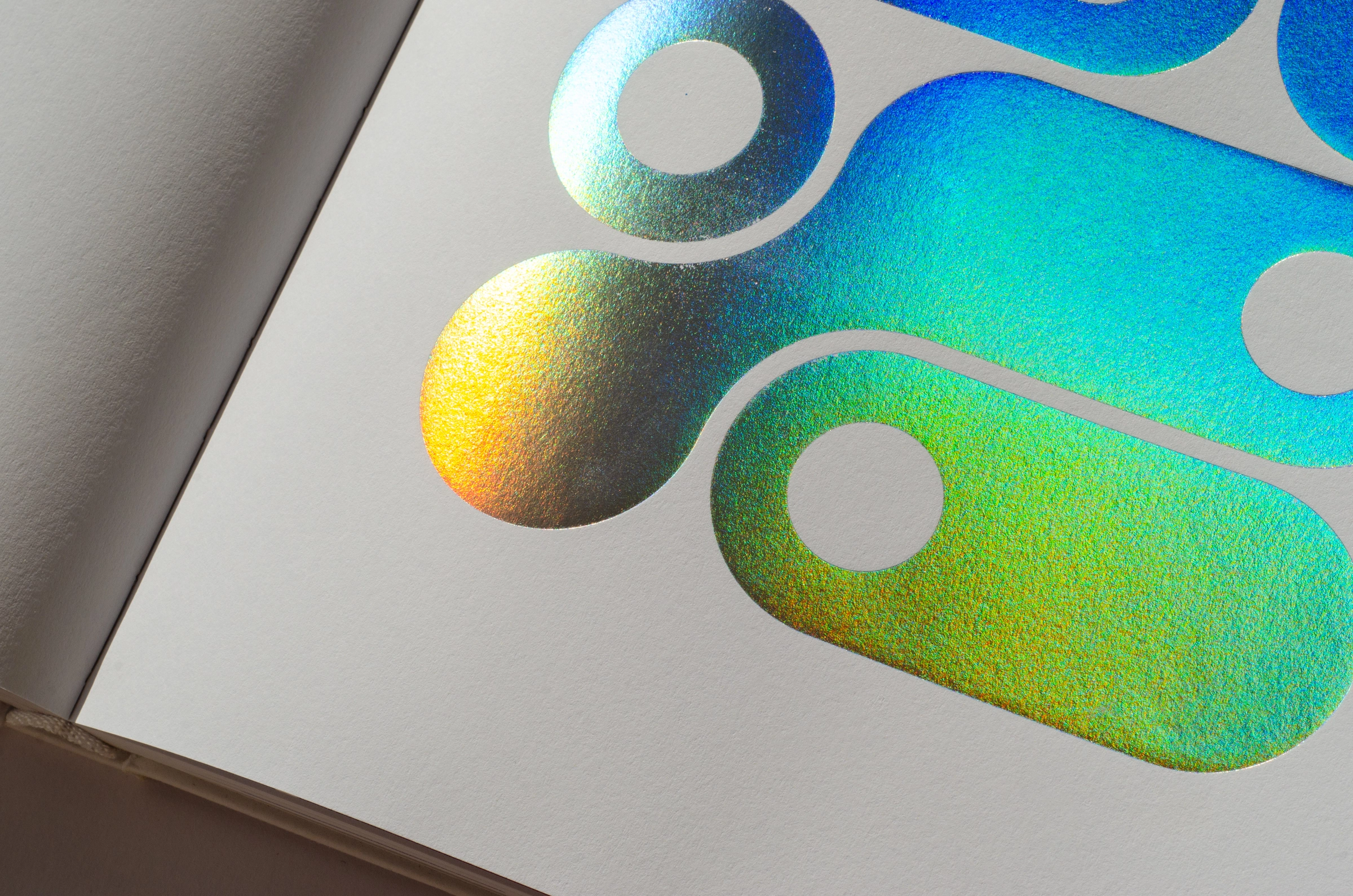
WIDS Zürich ConferenceConference branding

Money Motion Conference 2024Conference branding

Money Motion Conference 2025Conference branding

Money Motion Conference 2026Conference branding

JGL Pharma Valley signageSignage, Interior design
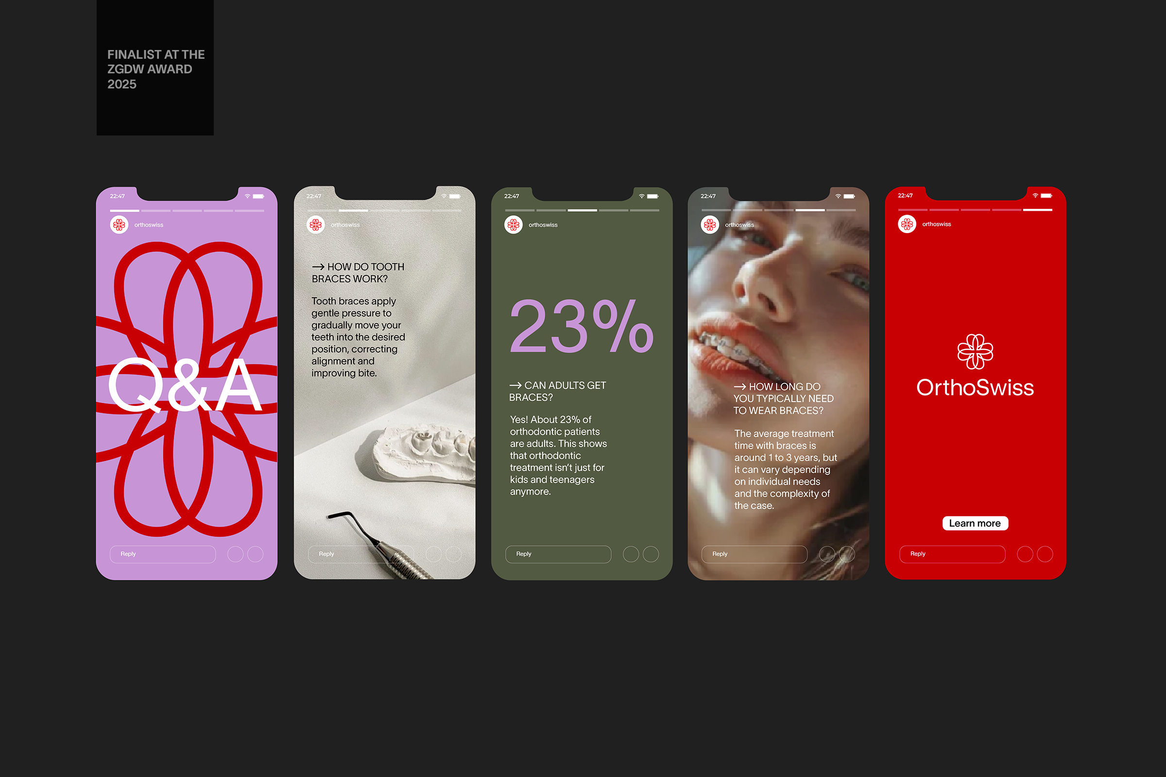
OrthoSwissVisual identity

JGL Annual Report 2022Editorial design

JGL Sustainability Report 2019Editorial design
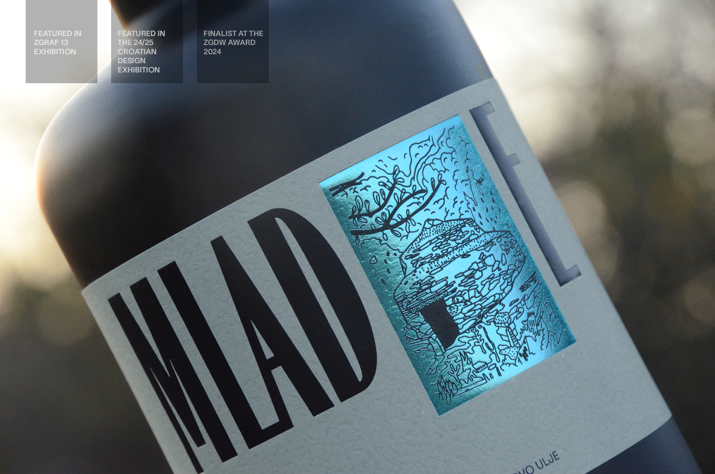
Mlade Olive oilPackaging

Bilić Olive oilPackaging

Decima sparkling wine labelPackaging

JGL Annual Report 2021Editorial design

Logo collectionLogo